What font does Google use is a question many designers, developers, and business owners ask when studying modern digital branding. Google has built one of the most recognizable visual identities in the world, and typography plays a major role in that success. The company uses a combination of Google Sans, Product Sans, and Roboto across its ecosystem to create a clean, readable, and highly consistent user experience.
You see Google’s fonts everywhere, including Android devices, Gmail, Google Search, Google Docs, and YouTube. Understanding why Google selected these fonts can help you improve your own website design, branding strategy, and content readability. This guide explains the fonts Google uses, where they appear, and why they remain effective in modern design systems.
Why Google Changed Its Typography Strategy
Google changed its typography system because older fonts no longer matched the demands of modern digital interfaces. The company needed fonts that looked sharp on smartphones, tablets, desktops, and wearables while maintaining readability across all screen sizes.
Google Sans became essential because it balanced professionalism with a friendly appearance that reflected Google’s approachable brand identity. Designers who create stylish online branding often use tools that generate stylish fonts for social media in seconds, since typography strongly influences how audiences react to digital content.
The transition also aligned with Google’s Material Design philosophy, which emphasizes usability, consistency, and visual clarity. Google understood that typography affects user trust, scanning behavior, and content engagement more than many people realize.
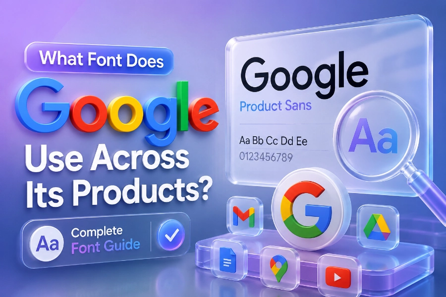
What Font Does Google Use In Its Logo?
Google primarily uses Product Sans for its logo and branding identity. Product Sans is a geometric sans-serif typeface created specifically for Google to achieve a softer, more modern appearance than traditional corporate fonts.
The rounded letters in Product Sans help Google appear more welcoming and less formal than many technology brands. You can especially notice this design style in the colorful Google logo, where the clean curves and balanced spacing create a playful but professional impression.
Google designed Product Sans as a proprietary font, meaning it is not freely available like Roboto or Open Sans. The company wanted a unique visual identity that competitors could not easily duplicate across products and advertising materials.
Why Roboto Became Google’s Most Important Interface Font
Roboto became Google’s main interface font because it performs exceptionally well on digital screens. The font combines geometric structure with natural letter spacing, making it highly readable across apps, websites, and operating systems.
Google introduced Roboto with Android to improve mobile readability and create a more modern visual experience. Many content creators are studying how content generators work, how to use them effectively, and also examining readable font structures because typography directly affects engagement and reading retention.
Roboto now appears across Android interfaces, YouTube menus, Google Play, and many Google Workspace products. The font remains popular among web designers because it loads quickly, scales efficiently, and maintains clarity even on smaller mobile screens.
What Font Does Google Use For Search And Gmail?
Google Search combines Google Sans and Roboto to create a balanced user experience. Google Sans is typically used for headings, navigation, and branded sections, while Roboto handles body text and functional interface elements.
Gmail also follows a similar typography structure because readability matters when users spend hours managing emails and business communication. Many marketers researching what an AI writing assistant is and how it is beneficial often focus on readability optimization because well-structured typography improves user interaction and comprehension.
This combination helps Google maintain visual consistency while preventing interface fatigue. Users can quickly scan inboxes, search results, and menu options without struggling to interpret the text.
Google Sans Vs Roboto: The Main Differences
Google Sans and Roboto may appear similar at first glance, but they serve different purposes within Google’s ecosystem. Google Sans focuses more on branding and personality, while Roboto prioritizes functionality and long-form readability.
Google Sans contains softer curves and wider spacing that create a friendly appearance suitable for logos, headers, and navigation sections. Roboto uses a slightly more neutral structure that supports dense interface layouts and extended reading sessions without overwhelming the user.
This distinction allows Google to preserve brand identity while maintaining usability across billions of devices worldwide. The company understands that typography should support user behavior instead of distracting from it.
Why Google Fonts Influence Modern Website Design
Google’s typography choices heavily influence modern website design because developers prioritize readability, speed, and mobile responsiveness. Fonts like Roboto, Open Sans, and Inter became industry favorites largely because Google demonstrated how effective minimalist typography can be.
Research consistently shows that users spend more time on websites with clean and readable text layouts. According to several UX studies, readable typography can improve user retention, lower bounce rates, and increase content interaction significantly across mobile platforms.
Many businesses now copy Google’s typography style because users associate clean fonts with professionalism and trust. This trend explains why minimalist sans-serif fonts dominate modern SaaS platforms, blogs, ecommerce stores, and mobile applications.
What Font Does Google Use Across Android Devices?
Android relies heavily on Roboto because the font was optimized specifically for mobile operating systems. Google needed a typeface that remained legible on small screens while maintaining a modern and clean appearance.
Roboto performs well under different lighting conditions and display resolutions, making it ideal for smartphones and tablets. The font also supports multiple language systems, which allows Android devices to maintain consistency across global markets and international users.
Google later expanded typography support through variable font technology and Google Sans Flex. These developments help Android adapt typography dynamically across foldable devices, smartwatches, and emerging interface technologies.
Why Typography Matters More Than Most People Think
Typography affects how people perceive information before they even begin reading the content itself. Fonts influence emotional reactions, trust levels, readability, and even purchase decisions on websites and mobile apps.
Google’s success with Google Sans and Roboto proves that typography is not only about aesthetics but also about usability and communication efficiency. A clean font system helps users process information faster, especially when browsing search engines, reading emails, or navigating complex digital interfaces.
Poor typography creates friction that discourages users from staying on a website for long periods. Businesses that ignore typography often struggle with low engagement, poor readability scores, and weaker user experience performance.
Best Alternatives To Google Fonts For Designers
Many designers use alternatives inspired by Google’s typography strategy when creating modern websites. Fonts such as Inter, Montserrat, Work Sans, Nunito, and Open Sans provide similar readability benefits while offering slightly different visual personalities.
Inter became especially popular because it performs extremely well in user interfaces and responsive layouts. Montserrat works effectively for branding and headings, while Work Sans delivers excellent readability for long-form blog content and informational websites.
Choosing the right font depends on your audience, branding style, and platform requirements. However, studying Google’s typography system gives you a strong foundation for making smarter design decisions.
How Google Maintains Typography Consistency
Google maintains typography consistency through strict design guidelines across all products and services. Every interface element follows detailed spacing, sizing, and readability standards to ensure users receive a predictable visual experience.
Consistency helps users navigate products faster because familiar typography reduces cognitive load. Whether someone opens Gmail, YouTube, Google Maps, or Google Docs, the typography system feels connected and intentionally designed.
This unified strategy strengthens Google’s overall brand recognition across devices and global markets. Few companies maintain typography consistency at the same scale and effectiveness as Google.
Conclusion
What font does Google use remains an important topic because Google’s typography decisions continue shaping modern digital design standards. The company primarily relies on Google Sans, Product Sans, and Roboto to balance readability, branding, scalability, and usability across billions of devices worldwide.
Google Sans supports branding and interface identity, while Roboto handles large portions of functional and long-form text throughout Android and Google Workspace products. This combination creates a modern user experience that feels clean, familiar, and highly readable across mobile and desktop environments.
If you want your own website or digital brand to feel modern and professional, studying Google’s typography strategy is a smart starting point. Fonts influence trust, readability, engagement, and visual identity more than most people realize, which is why Google continues investing heavily in typography innovation and user-centered design.