What font does Facebook use is a question many designers, marketers, and branding enthusiasts ask when studying one of the world’s most recognizable digital platforms. Facebook’s typography has evolved over the years, moving from the famous Klavika-inspired logo to a modern custom typeface designed for better readability and consistency across devices. Understanding these font choices helps you appreciate how typography influences trust, engagement, and user experience online.
Facebook’s branding is not successful by accident; every detail, from spacing to colors to typography, supports a clean, familiar visual identity. When you understand how Facebook uses fonts strategically, you can apply similar principles to your own website, app, or social media branding. This guide explains the history, evolution, and practical lessons behind Facebook’s typography system in a clear and engaging way.
Why Facebook’s Font Choice Matters
Facebook serves billions of users every month, which means every visual decision affects global communication and usability. The company cannot rely on decorative typography because readability and accessibility must remain strong across mobile devices, desktops, tablets, and different screen sizes. Facebook’s font strategy focuses on simplicity, familiarity, and fast recognition to improve the user experience.
Typography also influences how trustworthy a brand appears to users in daily online interactions. Many creators now use tools that generate stylish fonts for social media in seconds, as font presentation can shape engagement and brand identity in competitive digital spaces. Facebook keeps its typography clean and minimal because users spend more time on platforms that feel visually comfortable and easy to navigate.
The company also understands the psychological effect of typography in branding and communication. Rounded edges, balanced spacing, and clean letterforms make Facebook appear approachable instead of overly corporate or intimidating. This design strategy supports user retention because people naturally prefer interfaces that feel simple and visually organized.
The Original Facebook Logo Font
Facebook originally used a customized version of Klavika Bold for its early logo design. The font was modified by the Cuban Council, the design agency responsible for shaping Facebook’s recognizable visual identity during its early growth years. The logo became famous for its clean lowercase lettering and simple geometric design.
Klavika Bold gave Facebook a professional but friendly personality during the rise of social networking. The lowercase “f” and compact letter spacing helped the platform appear modern and approachable compared to older internet companies that relied on aggressive typography. Designers still reference Facebook’s old logo when discussing successful minimalist branding strategies.
One important detail is that Facebook never publicly released its exact logo font for commercial use. Many designers use Klavika Bold as the closest alternative because the official version includes custom modifications created specifically for Facebook. This exclusivity strengthened Facebook’s visual identity, making the logo instantly recognizable worldwide.
What Font Does Facebook Use Today?
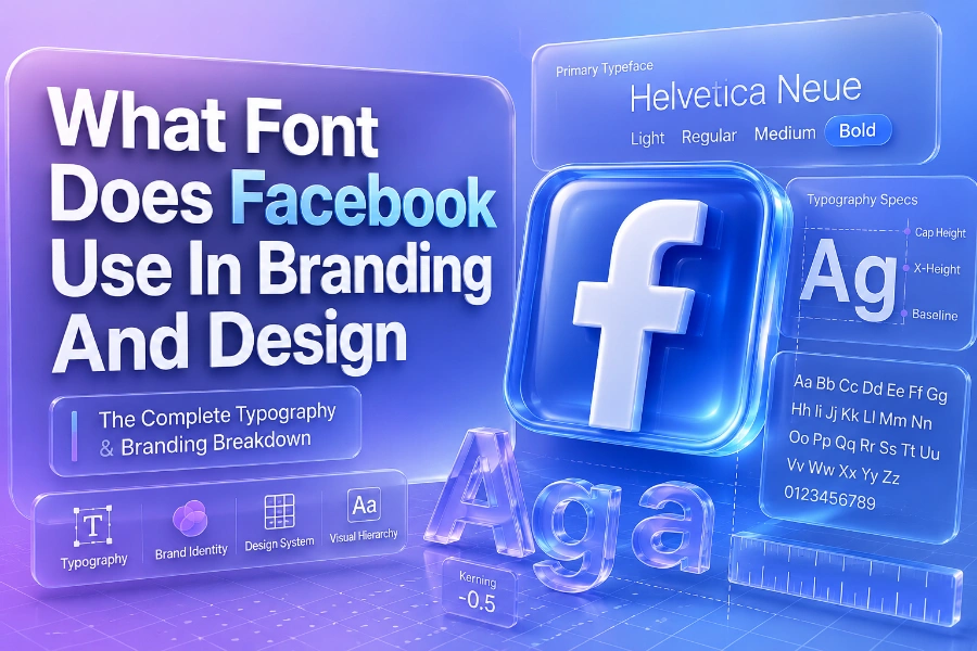
What font does Facebook use today? The company now relies heavily on Facebook Sans. Facebook Sans is a custom typeface developed in partnership with Dalton Maag to improve readability, consistency, and multilingual support across Facebook products. The font was introduced to unify branding across Facebook, Messenger, Instagram, and related services.
Facebook Sans was designed specifically for digital readability on modern screens and mobile devices. Typography experts often study articles like how content generators work and how to use them effectively because digital communication depends heavily on clean presentation and readable formatting. Facebook applies the same principle by using typography that remains sharp and clear even on smaller displays.
The font includes multiple weights and styles that help Facebook create visual hierarchy within its interface. Bold styles highlight notifications and important actions, while lighter weights improve reading comfort during longer sessions. This balanced approach helps users navigate content quickly without visual confusion or unnecessary distraction.
Facebook Sans And User Experience
Facebook Sans was created to improve both aesthetics and functionality across the platform’s ecosystem. The font supports dozens of languages and character sets, allowing Facebook to maintain consistent branding for users around the world. This flexibility is important because Facebook operates in regions with different writing systems and typography standards.
The company also focused heavily on accessibility while developing Facebook Sans. Designers researching what is an ai writing assistant and how is it beneficial often discover how readability affects content engagement and retention online. Facebook follows the same philosophy because accessible typography helps users process information faster and reduces eye strain during extended browsing sessions.
Another major benefit of Facebook Sans is visual consistency across applications and devices. Whether you use Facebook on Android, iPhone, desktop, or tablet, the typography remains stable and familiar. This consistency strengthens brand recognition while improving navigation and usability across Facebook-owned platforms.
Fonts Facebook Uses Across Devices
Facebook does not rely exclusively on Facebook Sans for every interface element across every device. The platform often uses system fonts to improve performance, loading speed, and compatibility on different operating systems. This strategy reduces rendering problems while keeping the interface responsive and visually stable.
On Apple devices, Facebook commonly uses San Francisco or SF Pro because these fonts are optimized for iOS and macOS environments. Android devices frequently display Roboto because it integrates naturally with Google’s operating system and maintains excellent readability on mobile screens. Windows systems often rely on Segoe UI for similar performance and compatibility reasons.
This multi-font strategy helps Facebook deliver a seamless user experience without sacrificing speed or accessibility. System fonts also reduce the amount of custom font loading required during page rendering, which improves overall performance. Faster interfaces increase engagement because users expect modern applications to load instantly without visual lag.
Facebook Brand Colors And Typography
Typography works closely with color psychology in Facebook’s overall branding system. Facebook’s most recognizable color is blue, particularly shades like #1877F2 and the older #3b5998 that dominated earlier versions of the platform. Blue creates feelings of trust, familiarity, reliability, and stability, which are important qualities for social networking platforms.
The combination of clean typography and simple colors helps Facebook avoid visual clutter within its interface. White backgrounds, soft gray accents, and minimalistic font styling allow users to focus more on content instead of decorative design elements. This design philosophy supports Facebook’s goal of maximizing user interaction and content consumption.
Typography and color consistency also strengthen Facebook’s advertising ecosystem. Businesses advertising on Facebook benefit from an interface that feels visually predictable and professionally structured. This consistency encourages users to trust the platform while interacting with personal content, business pages, and paid promotions.
Why Facebook Avoids Decorative Fonts
Facebook avoids decorative typography because readability and scalability matter more than artistic complexity. Decorative fonts may look attractive in logos or posters, but they often reduce clarity on smaller screens and mobile devices. Facebook prioritizes usability because billions of users access the platform under different viewing conditions every day.
Minimal typography also improves loading efficiency and interface consistency across browsers and operating systems. Clean fonts require less visual adjustment from users, which helps reduce cognitive fatigue during long browsing sessions. This subtle psychological effect contributes to stronger user retention over time.
The company also understands that typography should support content rather than overpower it visually. Facebook’s interface primarily displays posts, videos, comments, and conversations from users worldwide. Neutral typography keeps attention focused on user-generated content rather than distracting design choices.
How Facebook Fonts Influence Modern Branding
Many modern technology companies now follow typography strategies similar to Facebook’s design approach. Brands increasingly prefer custom sans-serif fonts because they improve readability, scalability, and cross-platform consistency. Companies like Google, Instagram, and YouTube also rely heavily on clean typography systems optimized for digital experiences.
Facebook’s typography evolution also influenced social media branding trends worldwide. Businesses now understand that typography affects credibility, engagement, and user perception almost as much as logos and color palettes. A clean font can make a website appear more trustworthy and easier to navigate.
Custom typography has become especially important in mobile-first design environments. Since most users browse content through smartphones, brands prioritize fonts that remain readable on smaller displays. Facebook’s transition toward Facebook Sans reflects the broader shift toward optimized mobile readability in modern digital branding.
Common Misconceptions About Facebook Fonts
One common misconception is that Facebook still uses only Klavika Bold throughout its branding system today. Klavika mainly influenced the early logo design, while Facebook Sans now plays a larger role in the company’s broader typography ecosystem. The modern interface depends heavily on optimized system fonts and custom digital typography.
Another misconception is that Facebook’s typography strategy is purely aesthetic. In reality, font selection directly affects accessibility, usability, readability, and even platform performance. Facebook invests heavily in typography because small design improvements can influence user engagement on a massive scale.
Some people also assume Facebook uses identical typography across all products and devices. The platform actually adapts typography based on operating systems and interface requirements to ensure better rendering and performance. This flexible strategy helps Facebook maintain visual consistency without compromising usability.
What Designers Can Learn From Facebook Typography
Designers can learn valuable lessons from Facebook’s typography philosophy and branding evolution. Simplicity often creates stronger long-term recognition than overly complex visual systems. Facebook’s clean typography demonstrates how minimalism can remain timeless even as technology trends change over the years.
Consistency is another important lesson you can apply to websites, blogs, apps, and digital marketing materials. Using too many fonts creates visual confusion and weakens brand identity across platforms. Facebook limits unnecessary variation to maintain familiarity and strengthen user trust.
Accessibility should also remain a priority when selecting fonts for digital experiences. Readable typography improves engagement because users process information faster and stay comfortable during longer interactions. Facebook’s success proves that functional design choices often outperform purely decorative trends in the long run.
The Future Of Facebook Typography
Facebook’s typography will likely continue evolving alongside advances in technology and user behavior. Future updates may include smarter adaptive fonts optimized for augmented reality, wearable devices, and immersive digital environments. Typography will remain central to Facebook’s branding because communication depends heavily on readable visual presentation.
Artificial intelligence may also influence how typography adapts dynamically across devices and user preferences. Personalized interfaces could eventually adjust font size, spacing, or weight automatically based on user behavior and accessibility needs. Facebook already experiments heavily with personalization, so adaptive typography seems like a natural progression.
Despite future changes, Facebook will probably maintain its core typography philosophy centered on simplicity and clarity. Clean sans-serif fonts remain highly effective for digital communication because they balance professionalism with usability. This timeless approach explains why Facebook’s typography continues to influence modern branding trends worldwide.
Conclusion
What font does Facebook use remains an important topic because typography plays a major role in digital branding, readability, and user experience. Facebook evolved from its early Klavika-inspired logo toward the modern Facebook Sans typeface, which supports accessibility, consistency, and scalable communication across devices worldwide. The platform’s typography choices demonstrate how clean design can strengthen recognition, trust, and long-term user engagement.
You can learn valuable branding lessons by studying Facebook’s approach to typography and interface design. Simple fonts, balanced spacing, readable layouts, and consistent visual systems often outperform flashy design trends that sacrifice usability. Whether you manage a website, create content, or build a social media brand, understanding Facebook’s typography strategy can help you create clearer and more effective digital experiences.