What font does Instagram use is one of the most searched questions among creators, designers, marketers, and social media managers who want their content to look modern and professional. Instagram’s typography plays a major role in how the platform feels because every font choice affects readability, branding, engagement, and user experience across mobile devices. Once you understand the fonts Instagram uses in Stories, captions, logos, bios, and Reels, you can create content that feels visually balanced and naturally optimized for the platform.
Instagram has evolved from a simple photo-sharing app into a visual-first social network where typography influences audience behavior almost as much as images and videos. Fonts help communicate emotion, personality, trust, and creativity without needing long explanations or excessive design elements. This guide explains the exact fonts Instagram uses, why the platform changed its typography over time, and how you can use similar styles to improve your own content strategy.
Instagram Sans And Why It Matters
Instagram introduced Instagram Sans to strengthen its visual identity and create a more recognizable experience across the app’s ecosystem. The font features rounded edges, clean spacing, and modern proportions that read well on mobile screens while still maintaining a creative personality for branding. Many creators also use tools that generate stylish fonts for social media in seconds, as visually appealing typography often increases profile engagement, improves Story aesthetics, and helps social content stand out in crowded feeds.
Instagram Sans was officially introduced in 2022 as part of Meta’s broader branding update across its digital platforms. The font was inspired by the curves and shapes of the Instagram logo, helping create consistency across the app icon, interface, and internal design system. You can notice Instagram Sans in marketing materials, advertisements, stickers, and several user-facing design elements throughout the platform.
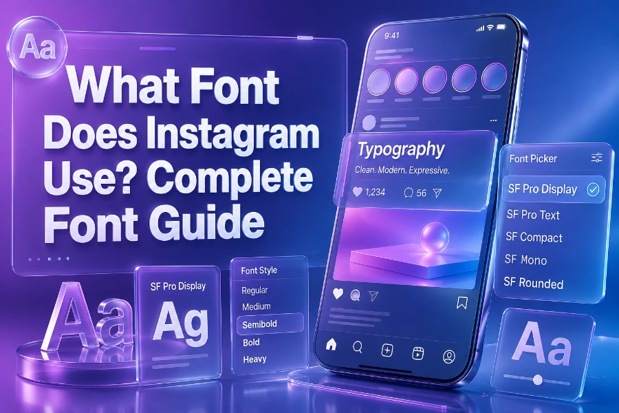
What Font Does Instagram Use on iOS and Android
Instagram does not use exactly the same font across every operating system because mobile platforms rely heavily on system-level typography. On iPhones and iPads, Instagram mainly uses SF Pro, which is Apple’s default interface font designed for readability, accessibility, and smooth scaling across different screen sizes. On Android devices, Instagram primarily uses Roboto because it integrates naturally with Google’s operating system and maintains a familiar appearance for Android users.
This platform-based font approach improves performance and keeps the interface visually comfortable for millions of daily users worldwide. System fonts load faster, scale better across devices, and reduce design inconsistencies that could negatively affect the user experience. Instagram combines these operating system fonts with its own branding fonts to create a balanced visual identity that feels both native and recognizable.
The Evolution Of Instagram Fonts Over The Years
Instagram originally used the Billabong font for its logo when the app launched in 2010 because the handwritten style felt casual, artistic, and youthful. Over time, Instagram shifted toward cleaner and more scalable typography because the platform expanded from a simple photography app into a global business and entertainment network. Many marketers studying digital branding also read articles like how ai helps with online content creation because typography, design, and content production now work together to shape online visibility.
The 2016 Instagram redesign introduced a more colorful identity while preserving the recognizable handwritten logo that users already associated with the brand. In 2022, Instagram Sans became a major step toward building a unified typography system that works across advertising, video, print materials, and digital interfaces. This transition reflects how modern platforms prioritize readability, accessibility, and cross-device consistency while still maintaining a unique personality.
Instagram Story Fonts Explained
Instagram Stories include several built-in fonts that allow creators to customize text without needing external editing software. Popular Story fonts include Classic, Modern, Neon, Strong, Typewriter, and Elegant, and each one communicates a different mood depending on the content style. Designers who focus on content strategy often discuss topics like what an AI writing assistant is and how it is beneficial because visual presentation and written communication now work closely together in digital storytelling.
Classic remains popular because it resembles traditional Instagram typography and works well for general content. Neon is often used for trendy or youthful posts because it adds a glowing effect that attracts attention quickly in fast-scrolling environments. Typewriter creates a nostalgic appearance that works especially well for storytelling, journaling, and minimalist aesthetic content.
Why Instagram Fonts Affect Engagement
Typography affects user behavior more than many creators realize because fonts influence readability, trust, and emotional response within seconds. Research from multiple marketing studies shows that visually organized text improves content retention and increases the likelihood that users will continue reading captions or interacting with Stories. Instagram’s font system is designed to reduce visual fatigue while keeping content engaging across different screen sizes and lighting conditions.
A clean and readable font encourages users to stay focused on your message rather than struggling to understand decorative text styles. Excessively complicated fonts may look creative initially, but they often reduce accessibility and decrease engagement when users cannot process information quickly. This is especially important because Instagram users typically scroll through content rapidly and make engagement decisions almost instantly.
Best Font Styles For Instagram Bios
Instagram bios have limited character space, so typography choices become even more important for readability and branding. Many users rely on stylish Unicode text generators to create unique bios that stand out while still remaining readable enough for profile visitors. The best Instagram bio fonts usually combine simplicity with personality instead of relying on exaggerated decorative symbols.
Minimalist fonts tend to perform better because they maintain clarity while still looking visually distinct from standard text. Bold serif-inspired Unicode fonts can work well for luxury brands, while rounded modern fonts often fit lifestyle, beauty, fitness, and entertainment profiles. You should avoid overloading your bio with too many symbols because excessive styling can make your profile appear cluttered or difficult to understand.
How To Choose Fonts For Instagram Content
Choosing the right Instagram font depends heavily on your audience, niche, and overall branding goals. Fashion brands often prefer elegant and modern typography, while gaming creators may use stronger and more futuristic font styles to match energetic visual themes. Educational creators usually perform best with highly readable fonts because clarity matters more than decoration when sharing information.
You should also consider consistency because using completely different font styles in every post can weaken your visual identity. Maintaining a recognizable typography style helps audiences associate certain visual patterns with your brand over time. Consistency also creates a more professional appearance that improves trust and strengthens audience recognition.
Common Mistakes People Make With Instagram Fonts
One of the biggest mistakes people make is using hard-to-read decorative fonts that reduce readability on smaller mobile screens. Another common issue is combining too many font styles in a single Story or graphic, which creates visual confusion instead of improving creativity. Instagram’s design system works effectively because it balances personality with readability rather than prioritizing aesthetics alone.
Overusing uppercase letters can also make text feel aggressive and visually exhausting when users read longer captions or Story slides. Poor spacing between text elements often reduces readability even when the chosen font itself looks attractive. You should always preview your typography on mobile devices because desktop editing sometimes hides readability problems that become obvious on smaller screens.
Fonts Similar To Instagram Sans
Several publicly available fonts resemble Instagram Sans closely enough for branding and content design purposes. Popular alternatives include Inter, Poppins, Helvetica, Proxima Nova, and Circular because they feature clean spacing, rounded edges, and strong readability across devices. These fonts are commonly used in modern branding because they balance professionalism with a friendly visual tone.
Poppins works especially well for social media graphics because its geometric structure feels modern without becoming overly technical. Inter is highly optimized for digital readability and remains popular among designers creating websites, apps, and online interfaces. Helvetica continues to remain relevant because its simplicity makes it versatile across both print and digital environments.
How Brands Use Instagram Typography Strategically
Large brands treat typography as part of their visual identity rather than just a design detail added at the end of content creation. Consistent fonts help audiences recognize branded content immediately, even before reading captions or seeing logos clearly. Instagram understands this principle well, which explains why its typography updates usually focus on strengthening brand recognition while improving readability.
Brands also use typography hierarchy to guide viewers through information quickly during fast-scrolling social media sessions. Larger text grabs attention first, while smaller supporting text provides additional context without overwhelming viewers visually. Effective typography strategy improves communication efficiency, strengthens branding, and helps content remain memorable long after users leave the app.
Conclusion
What font does Instagram use is an important question because typography directly affects branding, engagement, readability, and user experience across the platform. Instagram combines Instagram Sans, SF Pro, Roboto, and several built-in Story fonts to create a design system that feels modern, recognizable, and highly optimized for mobile interaction. Once you understand how Instagram uses typography strategically, you can build stronger visual branding, create more readable content, and improve the overall quality of your posts, Stories, captions, and profile design.
The most successful Instagram creators usually focus on balance instead of excessive decoration because readability remains essential for audience retention. Clean typography improves trust, supports accessibility, and helps viewers process information quickly in fast-moving social environments. Whether you manage a business account, personal brand, or creator profile, choosing the right font styles can make your content feel more professional, memorable, and visually effective.