What font should a resume be is one of the most important questions you can ask before sending applications to employers in the United States. Your font affects readability, professionalism, and how well your resume performs in applicant tracking systems that scan documents before a recruiter even opens them.
Choosing the right font can improve clarity, help hiring managers focus on your achievements, and make your application look polished at first glance. Read for more!
Why Resume Fonts Matter More Than Most Applicants Think
Your resume font influences how quickly recruiters absorb your information during a short screening process. Studies from hiring platforms regularly show recruiters spend only a few seconds reviewing a resume before deciding whether to continue reading. A clean and readable font helps your qualifications stand out without distracting the reader from your accomplishments.
Modern hiring systems also rely heavily on ATS software to scan resumes before they reach human eyes. Many applicants now use tools that can create stylish fonts for social media in seconds for creative projects, but resumes require simplicity because decorative typography can confuse ATS systems and reduce readability. Professional fonts work better because they maintain spacing consistency, improve parsing accuracy, and make your resume look organized across different devices.
Recruiters also associate font quality with professionalism and attention to detail. A messy or outdated font can create a negative impression even when your experience is impressive. Choosing the right style communicates confidence, organization, and professionalism before anyone reads your work history.
What Font Should A Resume Be For ATS Compatibility
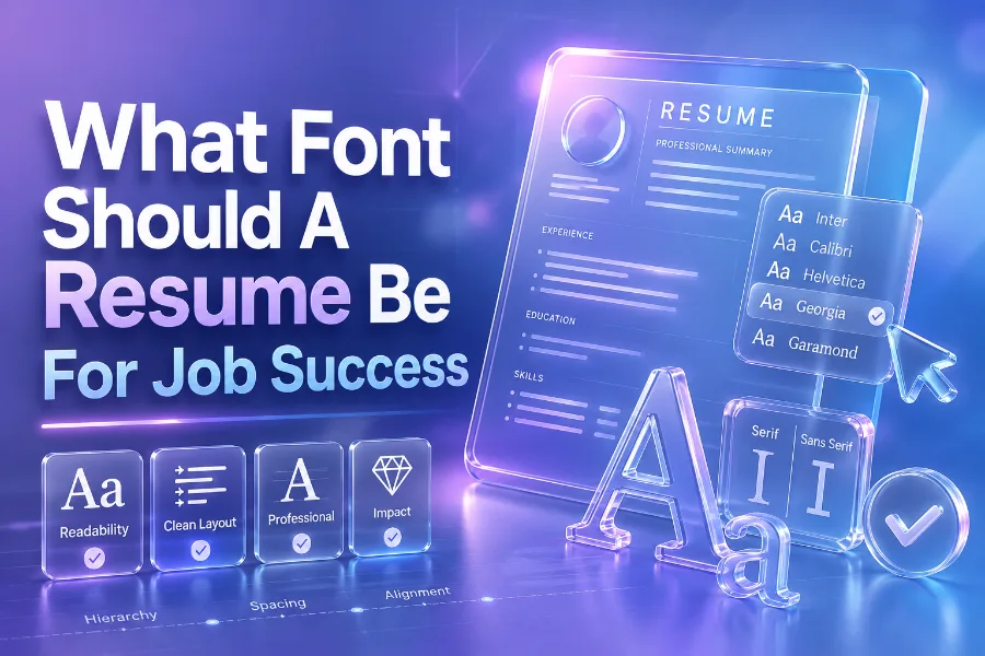
What font should a resume be for ATS systems depends on readability and formatting consistency. Most hiring software performs best with traditional fonts that use standard spacing and recognizable letterforms. Fonts like Arial, Calibri, Helvetica, Cambria, and Georgia remain strong choices because they are widely supported across operating systems.
ATS systems often struggle with decorative scripts, unusual spacing, and highly artistic typography. Fonts with excessive curves or condensed letters can create scanning errors that affect keyword recognition and formatting structure. That problem can reduce your chances of appearing in recruiter searches even when you meet the job requirements.
The safest approach is to use a clean font between 10 and 12 points for body text. Section headings should remain slightly larger to create visual hierarchy without making the page look crowded. Consistency matters because changing fonts repeatedly across sections creates confusion and weakens readability.
Best Sans Serif Fonts For Modern Resumes
Sans serif fonts are popular because they look modern, clean, and easy to read on screens. Recruiters reviewing digital resumes often prefer fonts that maintain clarity on laptops, tablets, and mobile devices. Fonts like Calibri, Arial, Helvetica, Open Sans, and Inter perform well because they remain readable even at smaller sizes.
Calibri became widely accepted after Microsoft introduced it as a default office font. It balances professionalism with a modern appearance, making it suitable for corporate, administrative, technology, and marketing roles. Arial also remains a reliable option because it appears clean without looking overly formal or outdated.
Many professionals who work in content creation and digital publishing also read guides explaining how content generators work how to use them effectively because formatting and readability influence user engagement online. Similar principles apply to resumes because readable typography keeps recruiters focused on your experience instead of struggling through poor formatting choices.
Best Serif Fonts For Traditional Industries
Serif fonts include small decorative strokes at the ends of letters, giving text a more traditional appearance. Industries such as law, finance, education, and publishing often respond well to serif fonts, as they convey professionalism and credibility. Georgia, Garamond, Cambria, and Times New Roman are among the strongest serif options for resumes.
Georgia performs especially well because it was designed for screen readability while maintaining an elegant appearance. Garamond looks refined and saves space because its characters are narrower than many other fonts. Cambria combines modern readability with a traditional style, making it suitable for both printed and digital resumes.
Some professionals who focus on communication strategy also examine resources explaining what an AI writing assistant is and how it is beneficial because an effective written presentation shapes first impressions online and offline. Resume typography follows the same principle because visual clarity helps employers absorb information more quickly and accurately.
Resume Font Sizes That Improve Readability
Choosing the correct font size matters just as much as selecting the font itself. Most recruiters prefer body text between 10 and 12 points because smaller text strains readability while oversized text wastes valuable space. Your name should normally appear between 18 and 24 points to establish a strong visual introduction.
Section headings should remain consistent throughout the document. Using 13 or 14 point headings creates separation without overwhelming the page. Bullet points should also maintain the same sizing to keep the document visually balanced and professional.
Margins and spacing also affect readability significantly. Adequate white space prevents the page from looking crowded and allows recruiters to scan information quickly. A resume with balanced spacing often performs better because it guides the reader naturally from one section to the next.
Fonts You Should Avoid On A Resume
Certain fonts damage credibility immediately because they appear childish, overly decorative, or difficult to read. Comic Sans remains one of the most criticized resume fonts because it lacks professionalism for serious hiring situations. Papyrus, Curlz MT, and Brush Script also create poor impressions because they prioritize style over readability.
Condensed fonts can also create problems because narrow letters become difficult to scan quickly. Courier New often looks outdated and mechanical, while Impact appears overly aggressive and visually overwhelming. Decorative fonts may seem creative, but most recruiters interpret them as distracting rather than impressive.
Even highly qualified candidates lose opportunities because poor presentation weakens recruiter confidence. Your resume should communicate competence and professionalism immediately. Simple typography nearly always outperforms flashy design choices during hiring evaluations.
Matching Resume Fonts To Your Industry
Different industries respond to different presentation styles, so your font choice should align with professional expectations. Technology companies often prefer modern sans serif fonts because they communicate innovation and simplicity. Legal and academic employers usually favor traditional serif fonts because they suggest authority and reliability.
Creative industries allow more flexibility, but readability should still remain the priority. Designers and marketers sometimes use fonts like Montserrat or Lato because they balance personality with professionalism. Even creative resumes should avoid decorative scripts that compromise ATS performance.
Healthcare, finance, engineering, and government positions generally favor conservative typography choices. Employers in these sectors value structure, clarity, and consistency. Selecting an appropriate font helps your resume align naturally with industry expectations before interviews even begin.
How To Make Your Resume Look More Professional
Strong typography works best when combined with clean formatting and concise writing. Use bold text carefully for headings and job titles while avoiding excessive italics or underlining. Consistent spacing between sections makes the document easier to scan during fast reviews.
Bullet points should focus on measurable achievements instead of vague responsibilities. Recruiters respond more positively to clear accomplishments supported by numbers, percentages, or business outcomes. Shorter sentences also improve readability and help hiring managers identify your strongest qualifications quickly.
File format matters as well because poorly converted documents can break formatting. Saving your resume as a PDF usually preserves typography and layout consistency across devices. Before submitting applications, always review your document on both desktop and mobile screens to ensure readability remains strong everywhere.
Common Resume Font Mistakes That Hurt Applications
One of the biggest mistakes applicants make is using multiple fonts throughout the document. Mixing styles creates inconsistency and distracts recruiters from your actual qualifications. Using one professional font family across all sections keeps the design clean and unified.
Another major problem is reducing font size excessively to fit more information on a single page. Tiny text frustrates recruiters and makes your resume appear cluttered. It is usually better to shorten unnecessary content than to compress everything into an unreadable format.
Many candidates also rely too heavily on visual elements such as graphics, tables, icons, or text boxes. ATS systems sometimes struggle to process these design elements correctly. A simple structure with readable typography almost always performs better during automated screening and recruiter evaluations.
Conclusion
What font should a resume be depends on professionalism, readability, and ATS compatibility rather than personal style preferences alone. Fonts like Calibri, Arial, Georgia, Garamond, Helvetica, and Cambria remain effective because they create strong first impressions while helping recruiters scan information quickly and accurately. When you combine a clean font with proper spacing, concise writing, and organized formatting, your resume becomes easier to read, more visually appealing, and more likely to move forward in the hiring process.
The best resume fonts never distract from your accomplishments because they support clarity instead of competing for attention. Employers want resumes that look polished, professional, and easy to review under time pressure. Choosing the right typography gives your application a stronger foundation and increases your chances of standing out in a competitive job market.